Kelly-Ann Peters

Our projects related to :

Hygie

hygie website view on computer and cell phone

Website

Hygie

Mandate

The Quebec company asked Parkour3 to redesign its website to make it more user-friendly. Hygie wanted to make its new platform a sales and corporate presentation tool better adapted to the reality of its business sector and its new business strategy. 

Our projects related to :

Cascades PRO

Website

Digital marketing

Cascades PRO

Mandate

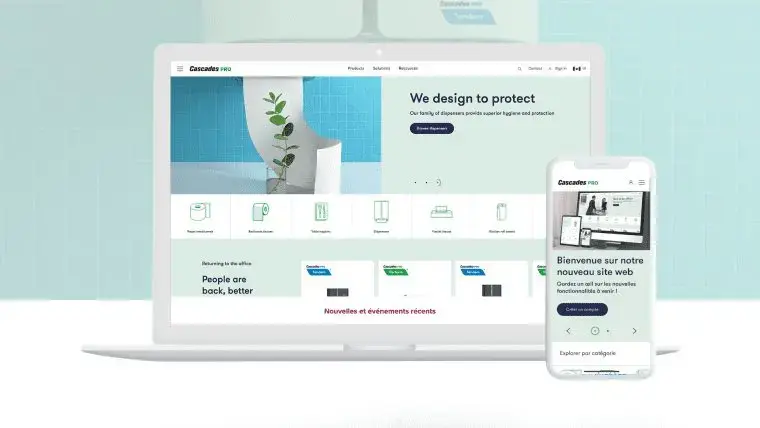
Cascades PRO wanted to ensure the sustainability of its digital environment, programmed over time by a multitude of service providers. We designed a web architecture that would guarantee the durability of the company’s technological assets while allowing the updating of the website and the modernization of its interfaces. We analyzed the company’s business objectives, the different usage contexts and the key performance indicators (KPIs). This allowed us to develop new generation solutions for existing technologies. Cascades PRO’s digital ecosystem is now focused on the most promising sales channels.

Our projects related to :

Renaissance

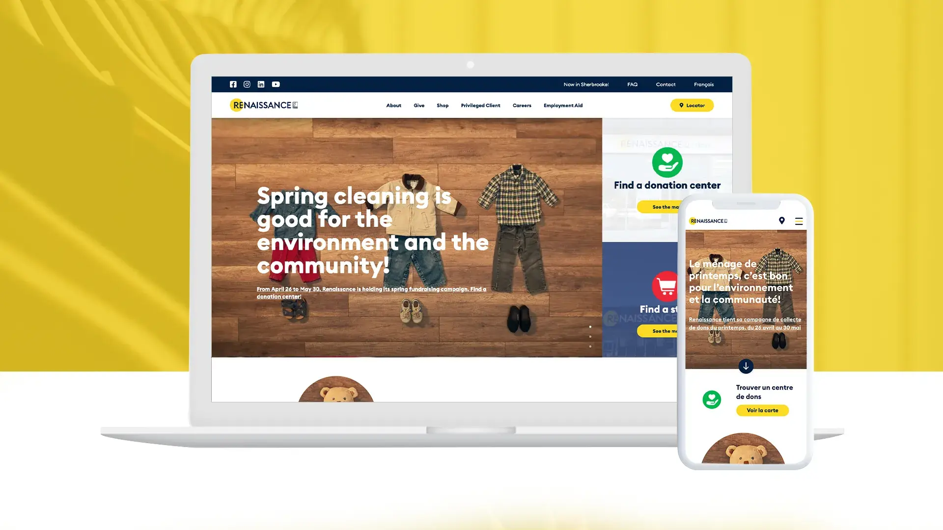
View of Renaissance website, on a computer and a cell phone

Website

Renaissance

MANDATE

The Parkour3 team successfully completed the redesign of Renaissance’s website. The main goal was to reflect the NPO’s new brand image and to optimize its online presence.

Our projects related to :

Partners in Design

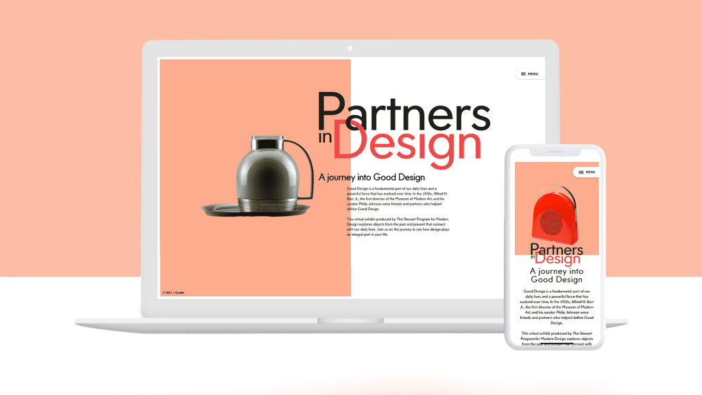
Patners in Design website view on computer and cell phone

Partners in Design

MANDATE

The Parkour3 team has created a website with a modern and sleek design to capture a new generation of visitors. The objective was also to digitalize the exhibition The “Good Design” to offer it to the largest number of online users.

Our projects related to :

FQM

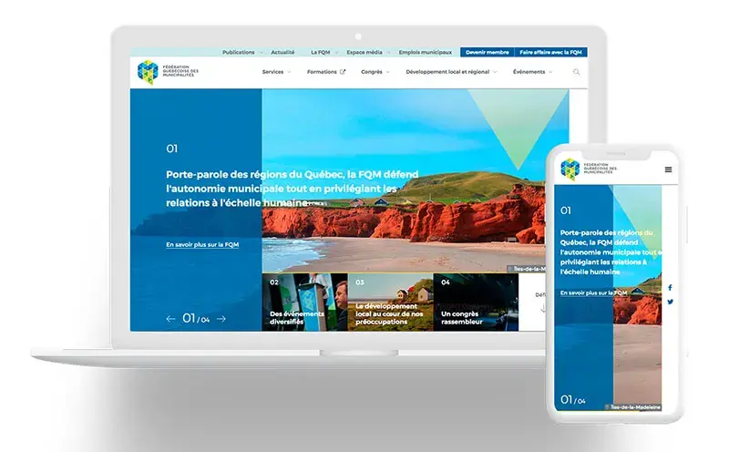
View of the FQM website, on computer and cell phone

Website

FQM

MANDATE

The FQM entrusted Parkour3 with the redesign of its website with the objective of offering a more user-friendly platform and an optimal user experience to improve member engagement. The FQM wanted to obtain more targeted content in order to position itself as a reference and spokesperson for municipalities throughout Quebec. The new web platform also had to reflect the Federation’s dynamism, relevance and efficiency.

Our projects related to :

Stardust Testing

Montage of the stylized P in the Parkour3 logo and a man with a telephone in his hand.

Stardust Testing

MANDATE

The Parkour3 team completed a website redesign for Stardust Testing during 2019. The main objective of this redesign was to better align the brand’s image with the company’s strategies.

Our projects related to :

Manutention Québec / Elevex

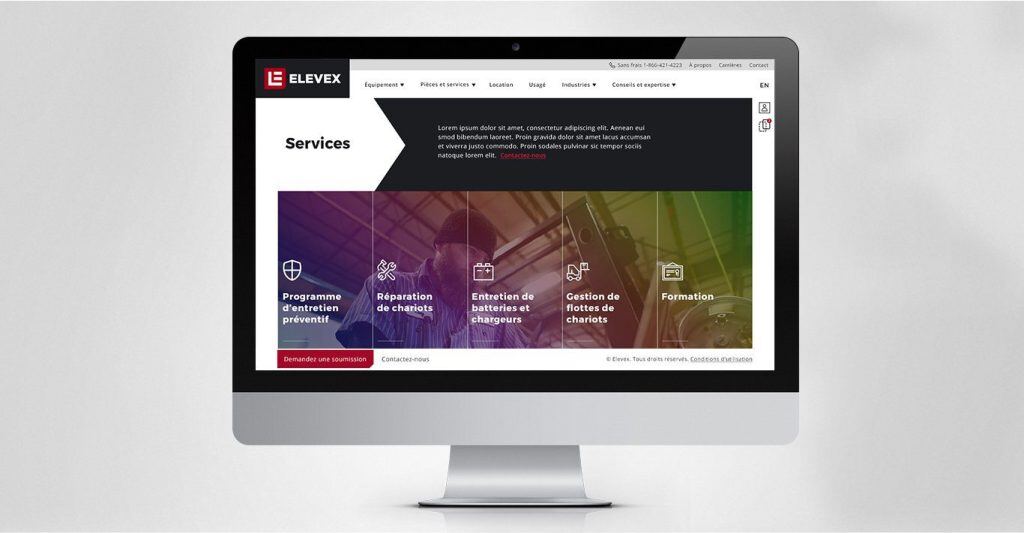
View of Elevex website, on computer

Manutention Québec / Elevex

MANDATE

As part of the redesign of their brand image, Manutention Québec, now Elevex, wanted to redesign their website to adapt it to their new universe.

Our projects related to :

Anima-plus

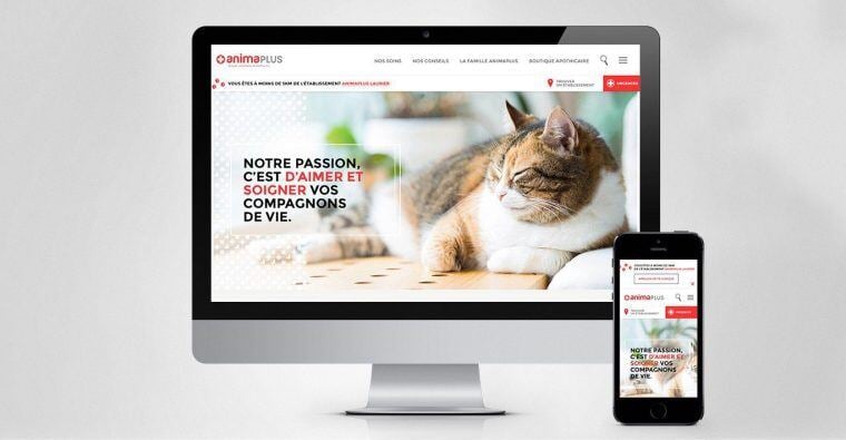
View of Lainco website, on computer and cell phone

Website

Anima-plus

MANDATE

The Anima-plus group wanted to develop a website to standardize the network of several clinics of the veterinary group. The goal was to simplify the management of the site by using an open source solution. In terms of design and customer experience, Anima-plus wanted to express the emotion and affection of animals through their new website.

Subscribe to our newsletter

Stay informed with the latest news

Join over 2,740 other subscribers by signing up for our newsletter and receive our latest news and tips from the digital marketing industry.

Newsletter