Renaissance
Client
MANDATE
Website redesign
LAUNCH
MANDATE
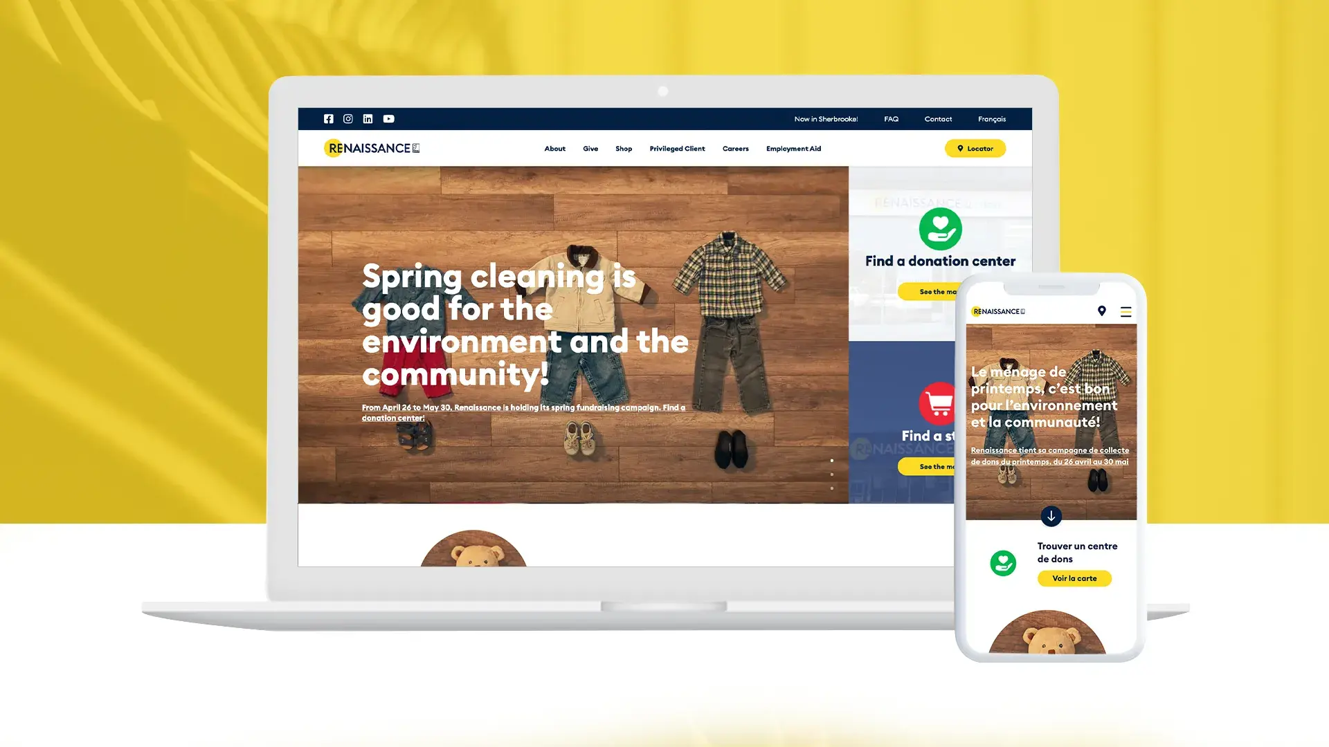
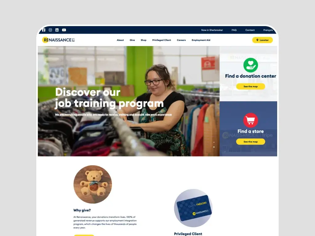
The Parkour3 team successfully completed the redesign of Renaissance’s website. The main goal was to reflect the NPO’s new brand image and to optimize its online presence.
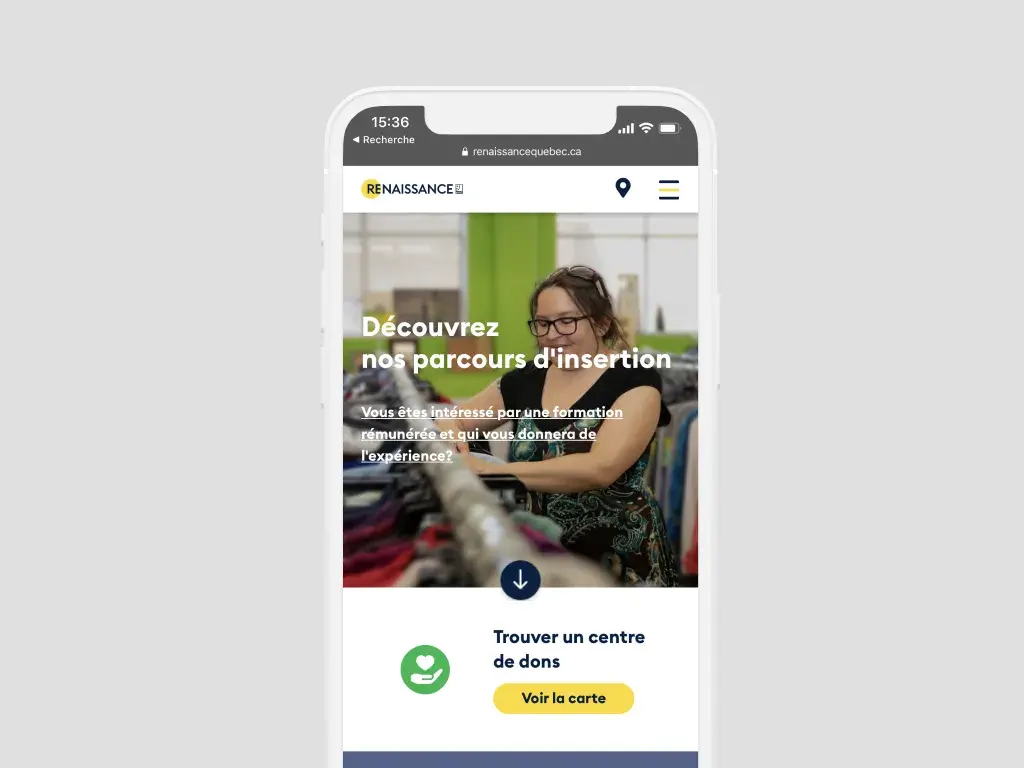
To provide the best possible user experience, we have designed the website to be easy to navigate. Visually, we’re talking about a modern design that reflects the organization’s image and a well thought-out ergonomic approach.
The Parkour3 team has committed to ensuring that the new Renaissance website will better present the NPO’s professional integration mission, because each year, Renaissance’s social mission helps thousands of people to reintegrate into the labour market.
Finally, the site is perfectly adapted to all platforms. The navigation on mobile is fluid and offers a real reading comfort.
ACHIEVEMENTS
Design of a modern and engaging website that reflects the new image of the NPO. Creation of a new user experience due to the ease of navigation.


